
All right guys. Let’s not waste any time here, okay? It’s V-day and wife is waiting for me upstairs. (Cue salacious music.)
So, I’ve been doing a lot of thinking. I’ve looked over my sketches in this post, and well… while there’s a lot to be proud of there, I just don’t know if I’ve opened myself up to options enough. You know? Sometimes the thing that’s best for us is what we don’t expect. Sometimes the thing that’s best for us ends up being the thing that somebody else has made with Photoshop and experience. (If I remember correctly, that last sentence was a direct quote from Benjamin Franklin’s Poor Richard’s Almanac.)
At the same time… my stuff is really compelling and really symbolizes a lot for me, and I got a really really good response when I posted them the other day.
Truth is, I’m pretty conflicted.
So, I’ve decided to put it all up for a vote. I’ll post the several submissions that people have made, and then I’ll ask you all to vote for the one that you like the best. I’ll also provide some critical feedback on these ones. Try really hard not to think about this:

or this:

as you look at these and cast your vote. That might be hard to do, but it’s what I sincerely ask. Think of it as a V-day present to yours truly.
All right! Be fair, okay guys?! And be nice. These are real people, and sometimes not everybody can have as much visual arts talent as me their peers. No hatin’.
First, Shane Hopkins, who blogs over at meaty chunks contributed this as a possibility:

Great effort, Shane! Let’s all give him a round of applause! (circles hand around while clapping like a sixty-seven-year-old grandpa who doesn’t realize that obnoxious joke isn’t funny anymore)
Okay, I’ll start out with the good stuff. Shane, great spelling of my name. You didn’t mess that up at all! You did so great at that. And you also made all your graphics fit in the square, so great job there too! And… well, yeah. That’s pretty much it. So good job, man!
As far as some constructive criticism, I don’t have to much too say, other than: 1. I like green not blue 2. the name is “THE Weed” not just “Weed” 3. It’s too blocky and not rectangly enough 4. was the word “weed” drawn with actual chalk? 5. if I’m being honest, the seeds floating in the air remind me of banana seeds and I’m allergic to bananas and 6. I can’t tell if the background is sky or water 7. the brightness of the white hurts my eyes and 8. I forgot what I was going to say but I had already typed 8. and I don’t want to press the backspace because I’m lazy.
Also, I think you mentioned that the seeds blowing in the wind were supposed to be connected to my ADHD in some way. Honestly, I take offense to that a bit. The fact of the matter is that
Next, we have a submission by Jessica Shumway who blogs over at Shumway. Here was her generous offering:

Great try, Jessica!!
As always, first, the good: What a neat font you chose! And you spelled all the words correctly, just like Shane did. You also got the color green in there, which I love because of its multifaceted implications that are so directly tied to me as a person (weed the drug, weed the plant, my eye color, the color of the shirt I’m wearing right now, the color of my uncle Ted’s face when he turned into a monster in a recurrent nightmare I had as a little boy, etc.).
Constructive criticism: WOW, okay, just where do I start here guys? (chuckles condescendingly) So, first? The bubbles thing? Not really my bag. I’m a dude. Not a chick. Not a chick who likes round circular shapes. I’m a man. I need manly graphics. Like guns and remote controls and tools and maybe some squares or the silhouettes of naked ladies you seen on big trucks’ mudflaps or something like that (except that would be totally inappropriate). So, there’s that. Second, my blog is not a carbonated beverage. Third, I think maybe if you had taken a look at my previous work-ups (I know I said to forget about those as we look at these, but how can you when it’s right there near the top of this post?!) you’d see that there are a LOT more shades of green that are maybe a bit more compelling than this one.
Anyway, other than that, I think it was a solid effort! Better luck next time!
Next we have a contribution from Halie Looper who blogs at so awful. gimme more:


UPDATE: Jessica Shumway has offered something I think is pretty fancy. I’m thinking of calling it the smorgasbord. I, for one, am pretty awe-struck by it. She even tilted some of them which makes it look so professional and sleek. Feel free to throw it in the running…

I like Shane's at the top if you changed the words to "the weed"…
But I'm really conflicted…it's hard to pass up on a design that includes poop…
I'd go with Lindsays, but change the font on it.
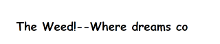
Well, crap. I still like the very first one. It made me laugh again. But then I skimmed to the bottom and was brought down by the actual rules, so Shane is my choice. But I would still use the "where dreams co" part because it's so….perfect.
Why aren't there any kitties?? Your blog needs lots of kitties! 😉
C weed. See Weed design something totally awesome. Word to the Weed.
If you didn't understand my sweet poetry I voted for Chris.
i don't know why everyone is avoiding the obvious.
chris, ftw.
I'm loving Chris's… especially your family in the back ground with the baby just laying there helplessly in the back ground instead of the Wife rocking her chanting "don't be a punk, don't be a punk" like she was the other night…but next best is Lindsay's.
"The weed . . . pass it around." my vote. Second best is the dandelion picture.
I like Shane and Lindsay's
Shane or Lindsay's.
Chris's made me laugh really hard. Through my nose.
I like the cartoon of you by your blog friend so awful….. It is a good likeness. Be careful of "Weed…get addicted." It is cute, but think about what audience you would attract. I was going to make "Life in 3D" "Sporting Some Triple D's." But I thought I would attract the wrong audience.
I like the poop. The subtle overtures of that design really spoke to me, but I worry other less artistic people might not see it and therefore it will not receive the due appreciation and respect it so deserves.
So, in that regards, my vote most go with Lindsey. Straight lines. A tiny bit of color. Very nice. "The Weed…pass it around" also has a way of speaking to my inner hippie.
Really, all those who sent their work to you should receive a round of applause. Kudos.
But if you're still looking for a design, I can bust out my crayons and some construction paper. You would be amazed at what I can do with a bit of glitter. Just let me know 🙂
i like the one shane donated
Shanes! Add "The"
wishing you much luck in picking from so many good contenders,
Barb Huff
I vote for Lindsay. I especially like the Rastafarian colors.
I love Chris's. It's perfect and memorable.
Lindsay. I like sharing.
also, halie's drawing of you looks earily similar to jared, of Subway fame.
I like Shane's (if you add "the" to it). Of course, if that image was lifted from The Internets, you and Shane could totally get pulled over by the Google police for using it, then they'd be all, "What's this Weed stuff about?" and it could get ugly.
Maybe you should stick with the poop.
My fav was Shane's with the added "THE."
I vote you use the lionel richie pic.
I think you should use something completely different and not represented here at all as to avoid hurting anyones feelings.
I vote for Shane's. 🙂 I'm a fellow crusader and new follower. Nice to meet you.
I like the one with the bubbles. Or the one with the dandelion…they're serene.
Also, I'm a fellow crusade lister and follower. Good luck.
I like Shane's.
*waves hi from the YA Paranormal group over at the Crusade* I'm a follower now.
I vote either Shane's with "the" added, or a fusion of Lindsay's and Halie's. Maybe your face on the side next to the Banner, Or in it somehow. Another striking possibility would be the picture of us cropped to only include me. You have a lot of options. Chose wisely my son! /brother who is ten years my elder.
I like how in the smorgasbord the poop kind of nestled into your dimple there.
Aw, how cute! I like the one done by Chris because of its absolute honesty. I'm not being sarcastic, either! I can't believe you're keeping your wife waiting and with, what, that salacious music! Shame on you! I hope you didn't get in trouble!
It's nice meeting a fellow crusader, btw!
♥.•*¨ Elizabeth ¨*•.♥
Chris' 😉
Hi from a fellow crusader
Lyn
W.I.P. It: A Writer's Journey
Seriously, what's wrong with the last one?
Hello! Fellow Crudader dropping in…BTW, I like Lindsay's…
Either Shane's or Lindsay's. Though Chris' is fantastic. I think he has somewhat of a fair advantage. Seriously; adding poop is almost like cheating, it automatically makes things more appealing. Perhaps he could collaborate with Shane and Lidsay?
so after reading your most recent post about "the unicorn club" (yeah, im going to talk in code), i have wandered around your blog for a few minutes (because im Mormon, i wish homosexuality was more openly accepted, because i love your family, and because i love funny people), and i have come to the conclusion that you are one of my favorite people. AND hilarious. its a package deal.
also- i love typing run-on sentences, commas, and have horrible punctuation 🙂